A New Look for Break Time
October 29, 2020
Written By Kennedy Ward
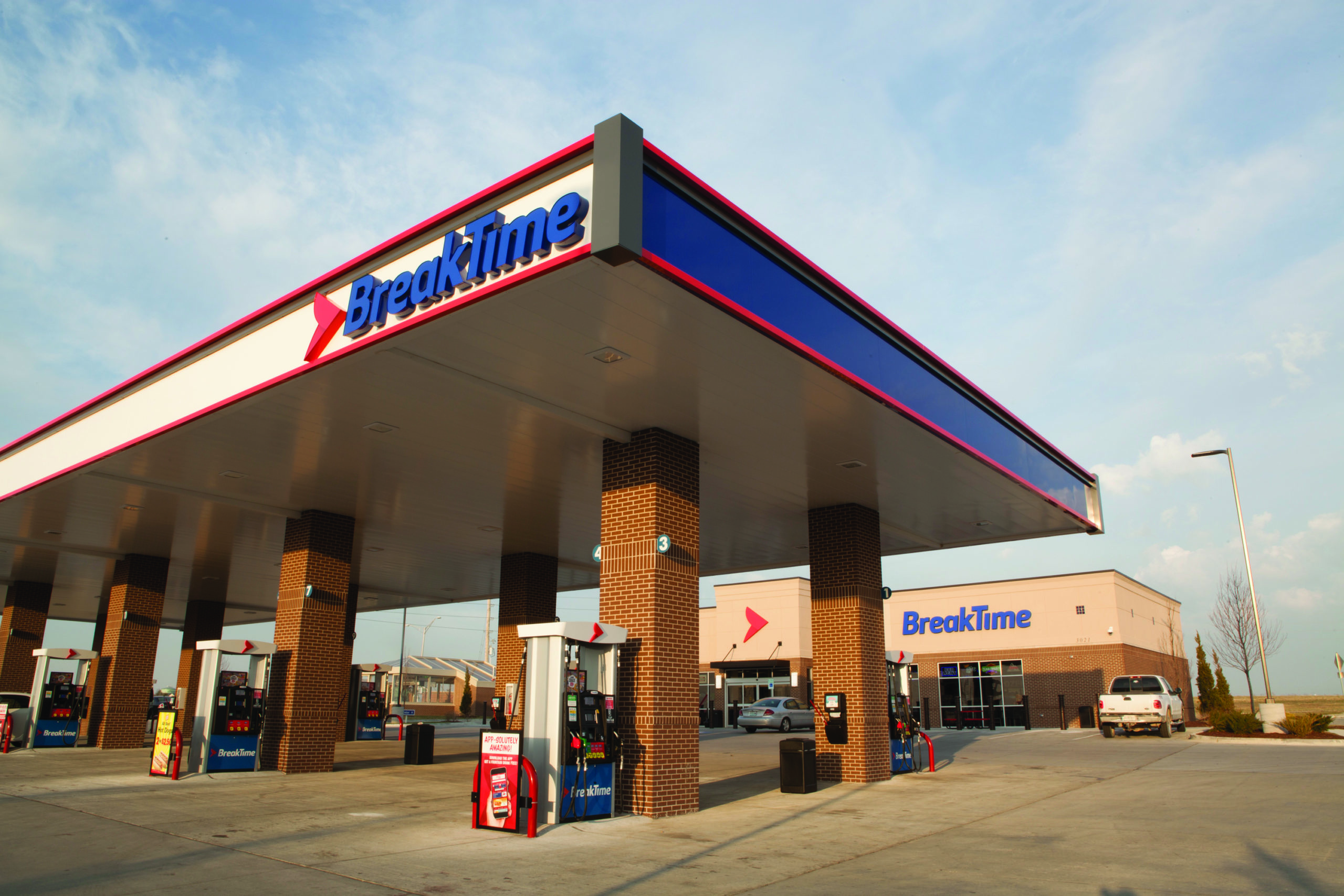
Since 1985, the logo for Break Time convenience stores has become instantly recognizable to many Missourians. With its bold lettering and fluid typeface, the logo has long complemented the brand’s reputation for delivering friendly service. However, the opening of the newest Break Time store in Columbia symbolizes a new era for the company as it transitions to a redesigned logo.
The new logo features a red arrow paired with blue wording. The arrow visually represents Break Time’s progress and vision for the future while the simple, yet bold wordmark gives the brand a fresh, modern feel.
The logo’s official rollout at the new store on East Elk Park Drive in Columbia represents the start of a multiyear rebranding campaign for the chain, though this is not the first time it’s been used. The new logo made its first appearance in 2017 when Break Time opened its Lee’s Summit location.
“Since the Lee’s Summit store was the only Break Time in that market, we felt it was an ideal test site,” says Anita Bichsel, senior marketing manager for Break Time. “It gave us an opportunity to see our new logo in living color, so to speak.”
When Break Time launched its MyTime Rewards loyalty program in 2017, it incorporated the rebranded logo’s red arrow in its loyalty card design and the chain’s fountain cups to familiarize customers with its new look. Plans are now underway to gradually begin updating the chain’s storefronts and fuel islands at its more than 70 locations throughout Missouri. The transition to the logo across all channels will happen slowly over the course of several years.
Although the striking change in the new location’s appearance has caught the attention of customers, Break Time’s commitment to being a neighborhood destination for anyone on the go remains
unchanged.
“Our goal is to make our customer experience consistent across all of our stores. We want our customers to know they can depend on Break Time to make their day better,” Bichsel says.


